Each year, the Dulux Colour Awards invites architects, interior designers, specifiers and students from Australasia to share work that celebrates the innovative use of colour.
With the winners of varying categories recently announced, the Residential Interior award recipient was the Erskineville House project by Lachlan Seegers Architect, which was commended for the use of a soft palette of pale yellow, warm grey and hues of green. Here, we take a look at some inspiring projects by the other 2022 finalists.
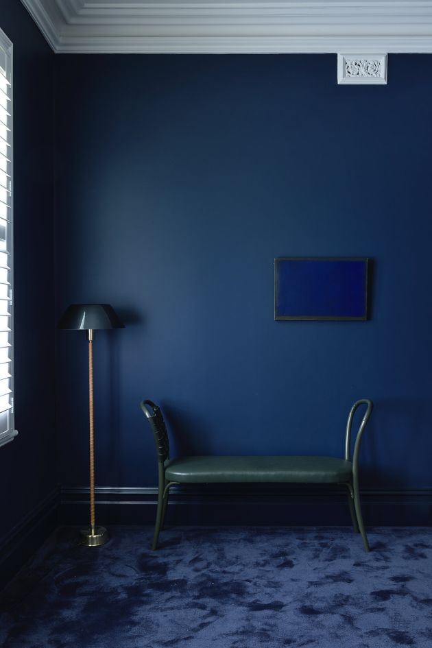
Believing colour to be a powerful and emotive tool, architecture and interiors firm Hindley & Co took the chance to put this theory to the test with the Arch Deco project, showcasing varying colours in each room, determined by the intended function and feeling of that space.
“We used combinations of Dulux Madame Mauve and Dulux Silver Thaw to paint the walls and ceilings in the living rooms, to intensify the shady mood of these south-facing areas,” explains director and principal Anne Hindley.
For those considering introducing more colour in the home, she notes the importance of answering some personal questions.
“Ask yourself who you are and how you want to feel in any particular space,” says Hindley.
“Then simply choose the colour that matches your instincts.”
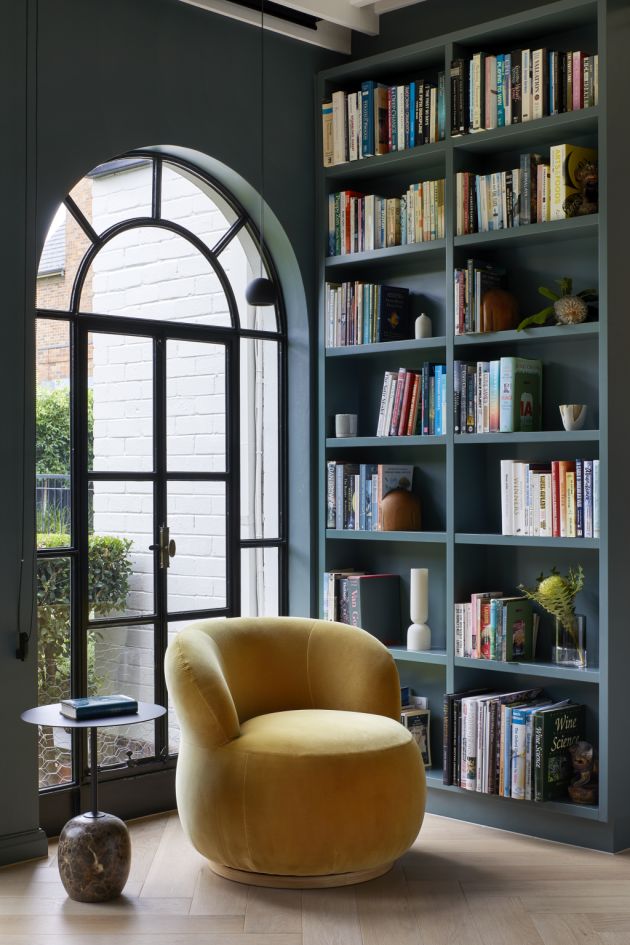
At the Malvern House project, undertaken by architecture practice Lande, heritage colours were explored early in the design concept, to acknowledge the new building’s predecessor.
“Maroons and greens were brought to the table in the form of stones to feature in the kitchen; a big part of the client’s brief was to bring greenery into the home,” says co-director Lachlan McArdle.
Grid House
Doherty Design Studio
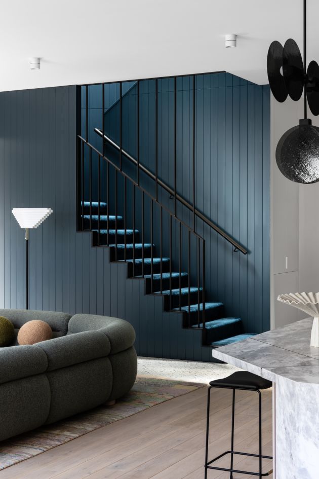
Responding to the challenge of adding a two-storey extension to an Edwardian home, Doherty Design Studio used the might of colour to develop an elegant fusion between the old and new at the Grid House.
“The deep teal colour called Dulux Copycat was used to define the threshold space between the original home and the new extension,” says director Mardi Doherty.
“This included the staircase and walk-in pantry, both of which are imbued in the deep colour, signalling a transition point for the home.”
Doherty points out that many other countries use colour with gusto, unlike Australia where it’s typical to paint your whole home white.
“We’ve had many clients nervous about using colour in their homes, but once it’s completed they love it,” she says.
Autumn House
Studio Bright
A recipient of commendations for both the Residential Interior and Single Residential Exterior categories, the Autumn House project by Studio Bright celebrates the elm tree at its heart, with a new north-facing extension that surrounds the tree and embraces its seasonal colouring.
“The new perimeter wall provides an Oyster Linen backdrop for the warm pink hues within and the landscape beyond, together with splashes of Earth Warming and custom pink concrete pieces, referencing the ever-changing autumnal colours of the tree,” says studio manager Patricia Karallis.
While a home is a sanctuary for ourselves and our family, first and foremost, Karallis advises home owners to consider any external modifications as an opportunity for an offering to the street.
Sourced: domain.com.au


