‘Be brave and go for it’: How to expertly use colour in the home and lift your mood
Minimalist or understated it may not be, but a home in which colour plays a starring role will always pack an evocative punch. Indeed, a perfectly considered palette can instantly set a mood-shifting scene, from warm and inviting to bold and dramatic or soothing and serene.
And that’s particularly pertinent as we head indoors for the coldest months of the year. With winter upon us, now is the time to give our homes and psyche an instant lift with colour.
Wendy Rennie, colour and concept manager for Haymes Paint, is a firm believer in the transformative power of colour.
“Understanding the effect of colour on your day-to-day environment is crucial,” she says. “It is not as simple as what is generally assumed – that blue is calming and green is balancing. The most important piece in the puzzle is your unique associations to colour that can come from personal experiences.”
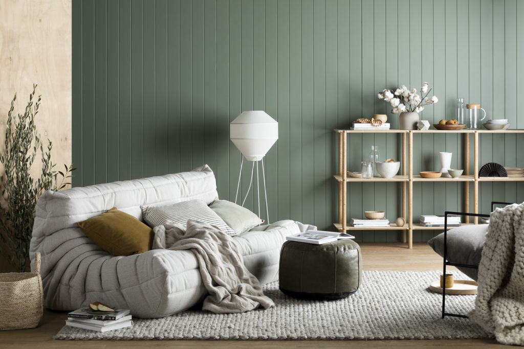
To create a sense of cosseting warmth, Rennie’s go-to hues are ‘tactile, earthy and organic’. Photo: Martina Gemmola. Styled by Ruth Welsby.
Certainly, the experts agree that time should be taken to consider the vibe you wish to create before bringing colour to life through paintwork, joinery, furniture, art and smaller decorative objects such as cushions, throws and colour-covered books.
As Rennie notes: “One person’s calm is another’s nightmare, so think about what different colours represent for you.”
Nonetheless, she believes it’s important to be mindful of the “general approach” to colour.
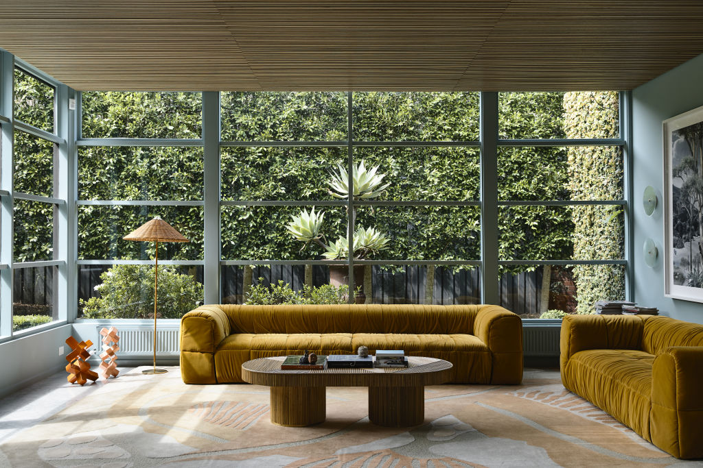
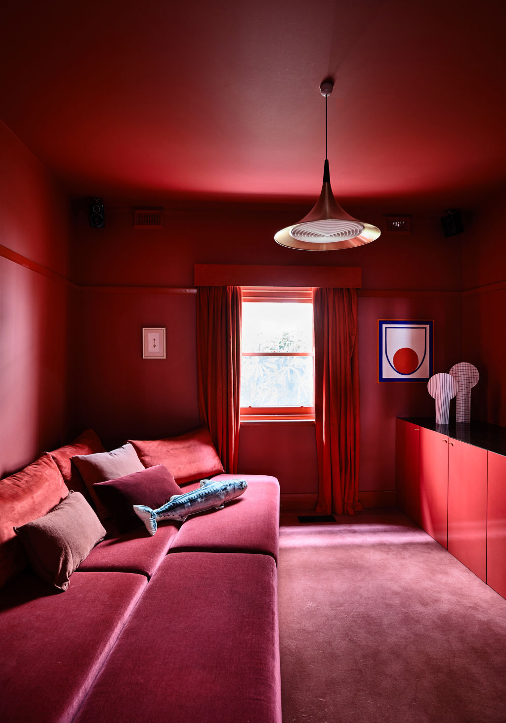
Colour was an undisputed star of Kennedy Nolan’s acclaimed Erskine House project. Photo: Derek Swalwell
“For example, yellow is seen as a colour that elicits emotional reactions, and is often referred to as the happy colour,” Rennie says. “Blue is seen as the colour of the mind, or the thinking colour. Red is the physical colour – we can have very strong reactions to it associated with energy and passion. Another colour that is growing in importance is green, which is recognised for creating balance and a direct connection to nature.”
There is no such thing as a ‘bad’ colour, says Patrick Kennedy. Just a colour in the wrong place. Photo: Derek Swalwell
“Darker colours can also provide a sense of intimacy or ‘colour cocooning’,” she says.
But should particular colours be avoided on the possibility that they may date a home? No, says Patrick Kennedy, principal of leading Melbourne architecture practice Kennedy Nolan.
Consider how colours interact with each other and with changing light conditions, Kennedy says. Photo: Derek Swalwell
“There is no such thing as a ‘bad’ colour,” he says. “Just a colour in the wrong place. Our memories are strongly formed through colour – and intensely so by intense colour.”
“The biggest issue is trust – trusting how you feel about colour and backing yourself,” Kennedy adds. “It is difficult, though, which is why white is so often a default. Our advice would be to do it, but consider how colours interact with each other and how they interact with changing light conditions. If you love a colour, play around with saturation, and be clear on which hue is right for you.”
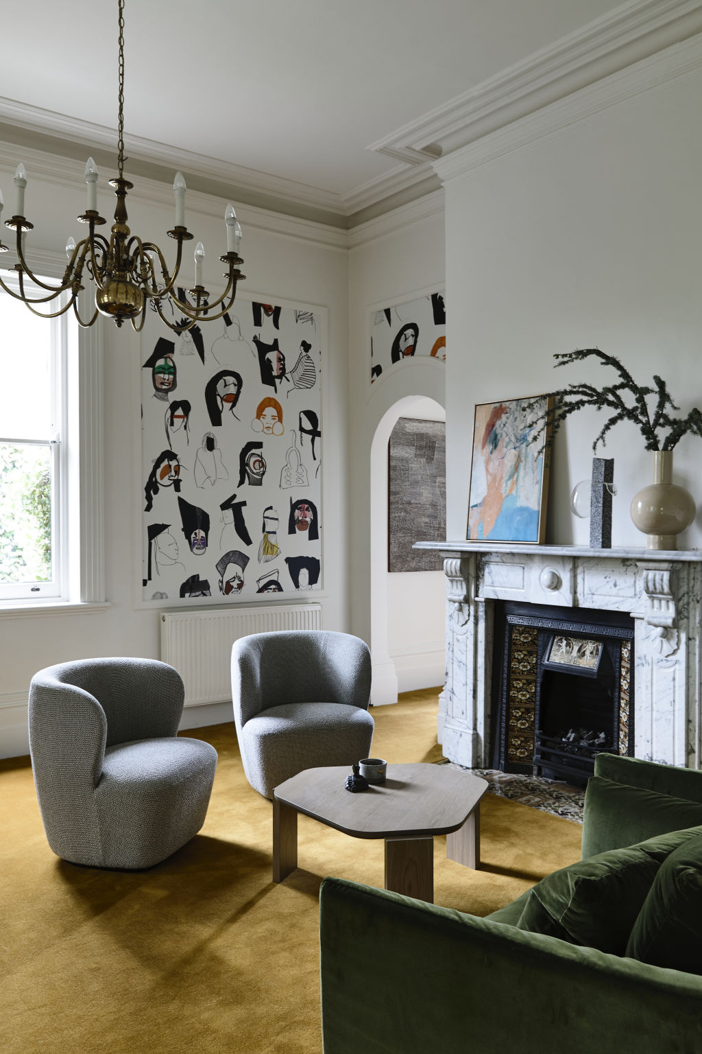
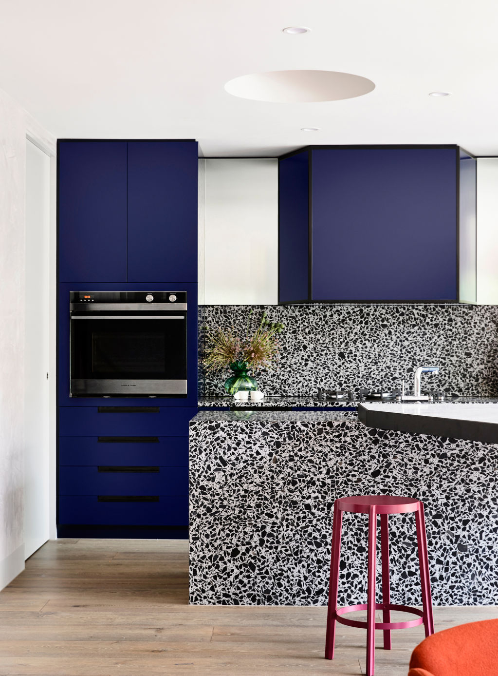
Doherty Design Studio employed colour to spectacular effect in its renewal of a St Kilda residence. Photo: Derek Swalwell
Certainly, colour was an undisputed star of Kennedy Nolan’s acclaimed Erskine House project.
“Colour can be very energising, but in this case, we were looking for it to imbue a sense of calm,” Kennedy says. “We were fortunate to have clients who were both interested and enthusiastic about the palette we developed.”
‘We used colour boldly, confidently and with gusto,’ Mardi Doherty from Doherty Design Studio says. Photo: Derek Swalwell
Award-winning Melbourne interior design practice Doherty Design Studio also employed colour to spectacular effect in its renewal of the St Kilda Residence.
As director Mardi Doherty says: “We used colour boldly, confidently and with gusto. The colour really contributes to the energy of the spaces – the home has an uplifting, positive vibe.
“Colour can evoke so many feelings, and the way a room feels can be transformed by colour and natural light. It doesn’t need to be used as boldly as it is in this home – even soft colours can impact the way a space feels.”
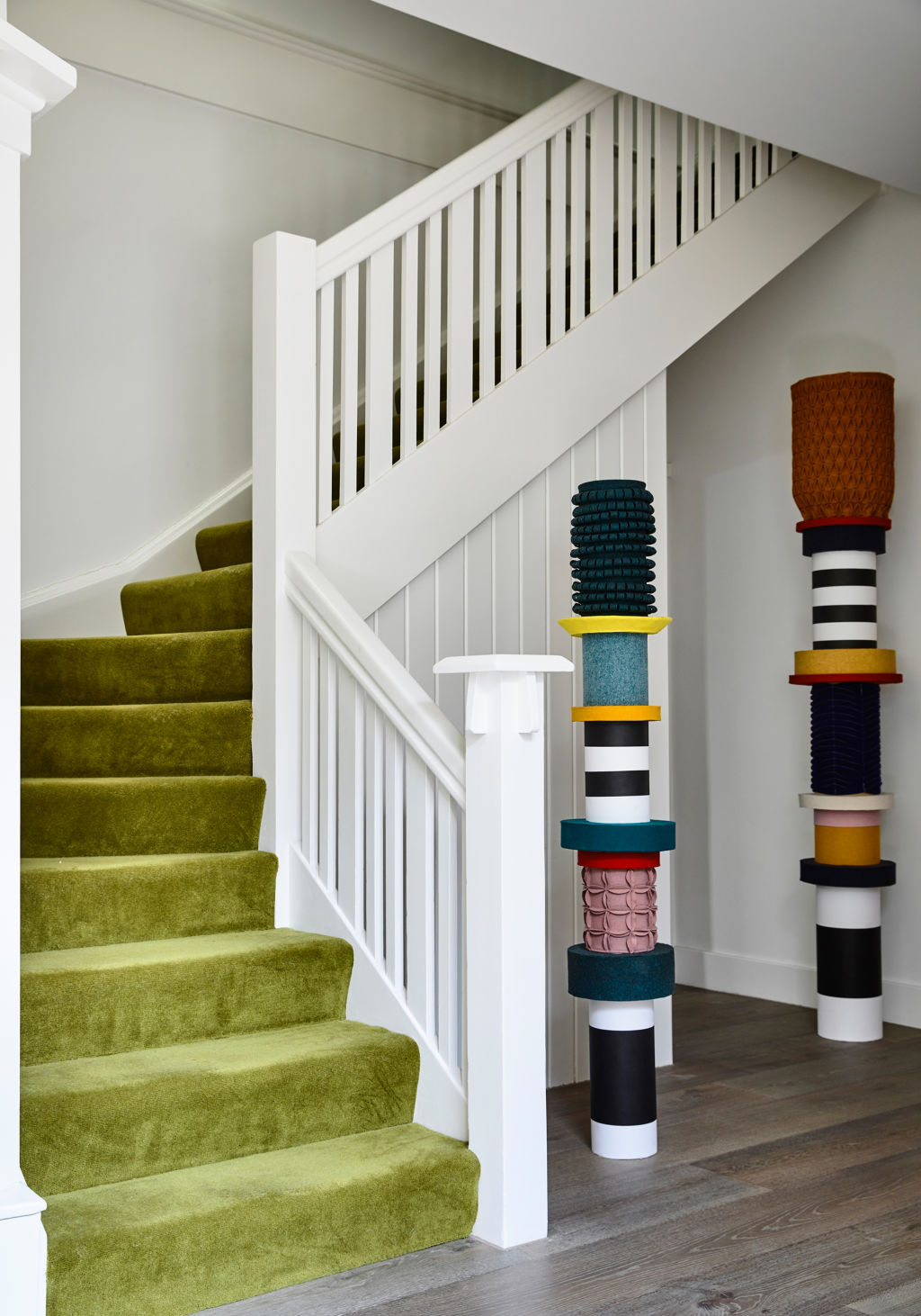
Doherty encourages the introduction of colour in unexpected ways, as seen in this pop of green carpet on the staircase. Photo: Derek Swalwell
Doherty encourages the introduction of colour in unexpected ways.
“Be brave and go for it,” she says. “Painting doors and ceilings are a great way to introduce colour without having to be as bold as painting an entire room a colour. Highlighting trims and skirtings in a contrast colour also provides interest in a room. Even in small doses, colour can bring such joy to a room.”
So set the tone for winter by opening the door to colour and bring your world to radiant life.
It’s official – the secret is out! Nine News has recently highlighted the top weekend getaway destinations in Australia, and our very own Inverloch has taken the spotlight as a premier choice for those seeking the ultimate coastal escape. As the team at Ray White Inverloch, we’ve always known how … Read more
Selling a property is a significant decision, and choosing the right real estate partner is crucial. At Ray White Inverloch, we combine local expertise with the power of Australasia’s largest real estate group to deliver exceptional results. This FAQ page addresses the key reasons why we are the top choice … Read more